“Bold” is not in Nike’s vocabulary this year. That kit is positively busy by the standards they’ve set in some of the other leaks.USMNT World Cup kit leaked online.
https://worldsoccertalk.com/2022/05/09/usmnt-world-cup-shirts-leaked-online/
If this is accurate, no return of the Waldo kits unfortunately.
They are simple white home/blue away kits with shaded lines. I thought Nike might get a bit bolder.
dirtynine's Digest - The Thread for Kits
- Thread starter Zososoxfan
- Start date
Total yawn. Don't see anyone looking to buy this shirt specifically in a few years. Yes, some people will buy these to have the latest, but as always you'll always see more hoops, red, sash, and generally better iterations at your pub comeUSMNT World Cup kit leaked online.
https://worldsoccertalk.com/2022/05/09/usmnt-world-cup-shirts-leaked-online/
If this is accurate, no return of the Waldo kits unfortunately.
They are simple white home/blue away kits with shaded lines. I thought Nike might get a bit bolder.
I half don't believe these leaks. Nike's been waiting 8 years to sell a statement US World Cup shirt. Sources aside, I'll still be slightly surprised if these end up being the actual kits. If they are, white over navy is fine and traditional. The royal blue is extra boring.
Soft pre-order launch for the USA Sweater - will be promoting next week, but if anyone is interested now, you’ll get an extra $5 discount right now when you check out.
I’m not going to link the new Juventus kit. You can see it on juvestore.com. It seems to have been approved by the same team that okayed the Aguero statue.
Ha. It's ok, bit the warm up jersey rips.I’m not going to link the new Juventus kit. You can see it on juvestore.com. It seems to have been approved by the same team that okayed the Aguero statue.
View: https://twitter.com/ESPNFC/status/1535230295330279425?s=20&t=MJnWdNpo435bC4m_GNIKcA
I’m partial to the Japanese kit.
I’m partial to the Japanese kit.
Nike dropped the Brazil World Cup kit today.
Love the collar and button detail on the home kit.
View: https://twitter.com/FBNotified/status/1556574522895220736?s=20&t=qC-49H7udbGPxbe6PDMl8A
Love the collar and button detail on the home kit.
View: https://twitter.com/FBNotified/status/1556574522895220736?s=20&t=qC-49H7udbGPxbe6PDMl8A
Better than the 2nd, scuba looking kit. I hope this is one of those years where they wear the 3rd more often than the 2nd.
This is one of my favorite Chicago Fire supporter accounts. Hey regularly mock up kits and swag, and I really enjoyed this one. See the thread for more.
Apparently, Adidas told the Fire that the 2022 kits were already locked despite last year’s rebranding. We should get something that reflects the new design for 2023.
Apparently, Adidas told the Fire that the 2022 kits were already locked despite last year’s rebranding. We should get something that reflects the new design for 2023.
I'm with you--that's rad AFThis is one of my favorite Chicago Fire supporter accounts. Hey regularly mock up kits and swag, and I really enjoyed this one. See the thread for more.
Apparently, Adidas told the Fire that the 2022 kits were already locked despite last year’s rebranding. We should get something that reflects the new design for 2023.
If this is the best we can do for the USMNT kit, color me uninspired. I will note that these have no Nike swoosh on the front (but on the inside collar) so perhaps this is fake news?
View: https://twitter.com/usmntonly/status/1559180693309198336?s=21&t=Kwyuhl5Z07k64u3FFMUTtw
View: https://twitter.com/usmntonly/status/1559180693309198336?s=21&t=Kwyuhl5Z07k64u3FFMUTtw
The white kit looks like a 1992 design, and not in a good way.If this is the best we can do for the USMNT kit, color me uninspired. I will note that these have no Nike swoosh on the front (but on the inside collar) so perhaps this is fake news?
View: https://twitter.com/usmntonly/status/1559180693309198336?s=21&t=Kwyuhl5Z07k64u3FFMUTtw
The white kit should be so easy to pull off. The crest is nearly perfect. Slap it on a white shirt without muddying it up too much and you have a clean looking design.
I agree, it's weak. Apparently Weston McKennie agrees too. His comment here is bad news for the hopes that this is a fake.If this is the best we can do for the USMNT kit, color me uninspired. I will note that these have no Nike swoosh on the front (but on the inside collar) so perhaps this is fake news?
View: https://twitter.com/usmntonly/status/1559180693309198336?s=21&t=Kwyuhl5Z07k64u3FFMUTtw
View: https://twitter.com/usmntonly/status/1559203466144358407
I’ve seen some other leaks with the same uniforms and they do have Nike symbols on the sleeves. I guess this is what we’re going with.I agree, it's weak. Apparently Weston McKennie agrees too. His comment here is bad news for the hopes that this is a fake.
View: https://twitter.com/usmntonly/status/1559203466144358407
And looking at other Nike kits for WC22 like the Brazil home jersey, this doesn’t look like a Nike thing but a US soccer decision. I’m guessing they don’t just go to Nike and say “make us new uniforms“. The federation must have a lot of final say. But that could be my personal bias too.
Makes it easier for the fans with monochrome TVs.Is it possible FIFA has more strict rules than AFCON regarding kits?
I remember one World Cup where they basically insisted that kits be virtually monochrome. Thankfully they've backed off that a little bit more recently.
It's very Dodge Neon.The white kit looks like a 1992 design, and not in a good way.
Looks to be a common thing with Puma's away jerseys.
View: https://twitter.com/EleteTSC/status/1561730694468059138
Very reminiscent of Nike's Euro 2004 "billiard ball" jerseys.
Kit-wise, Puma always takes their visual “system” too far. It’s very cringey. Nike makes plenty of mistakes but they rarely make bad design choices. They do ugly, but it’s ugly within a smart system of visual rules (which often means their designs carry the potential to grow on you, as - I’m afraid - the tie-dyed US kits will). Puma’s mistakes are undignified - they show a lack of discipline. Those are a very dumb set of kits. I feel bad for the countries they rep.
https://www.worldsoccershop.com/shop/details/men-s-puma-uruguay-home-jersey-2022_A1068437?affiliate_id=224718&click_id=4072987796&utm_content=224718&clickId=4072987796&utm_source=pepperjam&utm_medium=affiliatelinkThose are horribad. Just doing some quick Google Fu, only a small amount of official shirts have been revealed for the WC, and it's mostly good IMO:
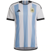
The Argentina shirt is always about the details, and the black trim makes this iteration pop. There's also terrific design elements on the back, with a single celeste vertical strip with the flag motif (sol de mayo) incorporated.
Brazil's home and away shirt have been revealed, and I'm a big fan of both:

The bright trim on the home shirt is a change of pace, but Brazil as a country has more flair and vibrancy than just about anywhere I've been, so well played Brazil. Then you look at the away shirt, and while it's even more nouveau, I think it's a home run.
Uruguay also went with a traditional shirt like their Rio de la Plata primos, and it's a win:

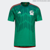
Mexico's home shirt continues their proud tradition of sick shirts. Love the mountain motif, gradient, and trim:
Switzerland went with a mostly plain red, but it's traditional in that sense so...OK.
Don't love the Morrocco shirt, as it looks as if it's main purpose is to emphasize the Puma logo.
I love Senegal's inverted Chevron and trim details, but the white primary is a missed opportunity with green, yellow, or red as a base making for a more attractive shirt.
The Argentina shirt is always about the details, and the black trim makes this iteration pop. There's also terrific design elements on the back, with a single celeste vertical strip with the flag motif (sol de mayo) incorporated.

Brazil's home and away shirt have been revealed, and I'm a big fan of both:

The bright trim on the home shirt is a change of pace, but Brazil as a country has more flair and vibrancy than just about anywhere I've been, so well played Brazil. Then you look at the away shirt, and while it's even more nouveau, I think it's a home run.

Uruguay also went with a traditional shirt like their Rio de la Plata primos, and it's a win:

Mexico's home shirt continues their proud tradition of sick shirts. Love the mountain motif, gradient, and trim:

Switzerland went with a mostly plain red, but it's traditional in that sense so...OK.
Don't love the Morrocco shirt, as it looks as if it's main purpose is to emphasize the Puma logo.
I love Senegal's inverted Chevron and trim details, but the white primary is a missed opportunity with green, yellow, or red as a base making for a more attractive shirt.
Last edited:
Mexico might have the sharpest jerseys in Qatar. They're not '98 level - nothing is - but that's a very nice kit.
Still don't know how I feel about the badge makeover, though.
Still don't know how I feel about the badge makeover, though.
Barca dropped their third kit. Lots of fans are complaining about the amount of white…
View: https://twitter.com/gerardromero/status/1562339487631433729?s=21&t=K_pGsF1xIgjymj2LtpgIlw
View: https://twitter.com/gerardromero/status/1562339487631433729?s=21&t=K_pGsF1xIgjymj2LtpgIlw
I like the shirt! Not as much as the blaugrana sash on yellow, but still good. I strongly dislike the trend of monochrome shorts and socks (and often shirt) though. My favorite strips of all time almost always feature an interesting and/or classic 2-tone shirt, and the shorts and socks each having one of those (e.g. white shirt with thick horizontal blue stripe, blue shorts, white socks), and it seems like every effing club now goes for a CLEVER color top to bottom. Some classic strips that look sharp:Barca dropped their third kit. Lots of fans are complaining about the amount of white…
View: https://twitter.com/gerardromero/status/1562339487631433729?s=21&t=K_pGsF1xIgjymj2LtpgIlw


Attachments
-
679.1 KB Views: 6
Where do I get a 420 Nelson jersey?I have now found the best thing ever, from Willie Nelson's 4th of July Picnic show in Austin:
View attachment 54658
Love this. Purple is underused.
View: https://twitter.com/goal/status/1564197446732898306?s=20&t=PCqnFZISGSQ3FTSb6AfjDA
View: https://twitter.com/goal/status/1564197446732898306?s=20&t=PCqnFZISGSQ3FTSb6AfjDA
Also not too far a departure from Argentina's usual navy away strip. I like it, and if the shirt somehow conjures the good juju of peak Gabi Batistuta, I'm here for it.Love this. Purple is underused.
View: https://twitter.com/goal/status/1564197446732898306?s=20&t=PCqnFZISGSQ3FTSb6AfjDA
View: https://twitter.com/brfootball/status/1564253205797773312?s=20&t=m6sIS0qIraH8l7hVEYSjnQ
Adidas is killing it. This is gorgeous.
Adidas is killing it. This is gorgeous.
That’s sick. WTF are we doing with Nike again???View: https://twitter.com/brfootball/status/1564253205797773312?s=20&t=m6sIS0qIraH8l7hVEYSjnQ
Adidas is killing it. This is gorgeous.
So, it looks like it's...
1. Adidas
.
.
.
.
.
.
.
.
.
.
.
.
.
.
.
.
.
2a Nike
2b Puma home
.
.
.
.
.
.
.
.
.
.
.
.
.
99 Puma Away
1. Adidas
.
.
.
.
.
.
.
.
.
.
.
.
.
.
.
.
.
2a Nike
2b Puma home
.
.
.
.
.
.
.
.
.
.
.
.
.
99 Puma Away
I've been planning on buying a Mexico jersey for a while now... that away kit makes it an easy decision!
It wasn't so much the purple that gave Batigol his power - it was more the big Nintendo logo.Also not too far a departure from Argentina's usual navy away strip. I like it, and if the shirt somehow conjures the good juju of peak Gabi Batistuta, I'm here for it.
Absolutely beautiful. Mexico is killing it.View: https://twitter.com/brfootball/status/1564253205797773312?s=20&t=m6sIS0qIraH8l7hVEYSjnQ
Adidas is killing it. This is gorgeous.
These might be my favorite for WC2022View: https://twitter.com/brfootball/status/1564253205797773312?s=20&t=m6sIS0qIraH8l7hVEYSjnQ
Adidas is killing it. This is gorgeous.
Does anyone have a good website for ordering team unis? One of the guys on my squad offered to sponsor some new kits and I'm not having a ton of success finding what I want. For our current kits, I used The Team Factory for a Joma template and they came out great (although they should've told us to size up!). I went back to that website and there's been a lot of changes over the past few years that don't make it as good anymore. It does look like The Team Factory has a more customizable service called Gear Team Apparel, which definitely has the design elements I like, but I have no idea if the quality is any good. In any event, please let me know if y'all have any input. TIA!
Purple? There is no purple in Argentina's flag.Love this. Purple is underused.
View: https://twitter.com/goal/status/1564197446732898306?s=20&t=PCqnFZISGSQ3FTSb6AfjDA
Clearly, Mexico's goal is to encourage bouts of vertigo to members of the opposing squad. Yuck.View: https://twitter.com/brfootball/status/1564253205797773312?s=20&t=m6sIS0qIraH8l7hVEYSjnQ
Adidas is killing it. This is gorgeous.


