dirtynine's Digest - The Thread for Kits
- Thread starter Zososoxfan
- Start date
hey thanks! Our jerseys should be iconic, every single edition (not just World Cup years). It's really too bad that Nike doesn't think that way.@dirtynine, these are incredible.
Kanji readers on Twitter say it reads "This is Corinthians" in broken Japanese.
Which reminds me of my friend Dave, who got "escape from dangerous uncle" in kanji tattooed on his calf as meta-joke about other white people's Chinese script tattoos. It always prompted interesting conversations with strangers during the summer.
Which reminds me of my friend Dave, who got "escape from dangerous uncle" in kanji tattooed on his calf as meta-joke about other white people's Chinese script tattoos. It always prompted interesting conversations with strangers during the summer.
That is tremendous.Which reminds me of my friend Dave, who got "escape from dangerous uncle" in kanji tattooed on his calf as meta-joke about other white people's Chinese script tattoos. It always prompted interesting conversations with strangers during the summer.
I just saw the Lady Liberty oxidized copper and that’s such a brilliant and unique look that I’m actually mad that no one has thought of it or implemented it sooner.hey thanks! Our jerseys should be iconic, every single edition (not just World Cup years). It's really too bad that Nike doesn't think that way.
The most frustrating thing about the US kits is Nike, as an American manufacturer, should have seen this return to the World Cup as an opportunity to make a statement. It looks like some junior intern spent 90 seconds in MS Paint designing those kits and I think that speaks to Nike’s complacency as well as their complete inability to establish a USMNT identity in the last 30 years.
If this is the effort they put into the first major USMNT kit in 8 years then just source it to Adidas or anyone that looks like they might actually care.
My guess is that US Soccer doesn’t just go to Nike and say “make us a kit. Show us when it’s done.” There is much more collaboration between Nike and US Soccer, with Nike presenting ideas and US Soccer giving feedback that leads to alterations and so on. It’s too collaborative to put it all on Nike. I mean, they made the super creative (but likely a miss) Nigeria kit, the really nice Brazil kits, and the “I’m not sure how I feel about it yet” Portugal kits. Point is that these are all very different designs, which tells me that input from the federations played a big role in the final product. I do despise US Soccer so my bias should be noted though.I just saw the Lady Liberty oxidized copper and that’s such a brilliant and unique look that I’m actually mad that no one has thought of it or implemented it sooner.
The most frustrating thing about the US kits is Nike, as an American manufacturer, should have seen this return to the World Cup as an opportunity to make a statement. It looks like some junior intern spent 90 seconds in MS Paint designing those kits and I think that speaks to Nike’s complacency as well as their complete inability to establish a USMNT identity in the last 30 years.
If this is the effort they put into the first major USMNT kit in 8 years then just source it to Adidas or anyone that looks like they might actually care.
As a Spurs fan, my impression of Nike as a kit designer is that they do usually go pretty high-effort for the clubs & countries that they value the most or that push them the most, and then they get really lazy, really fast with recycled ideas and templates for the rest of their work.My guess is that US Soccer doesn’t just go to Nike and say “make us a kit. Show us when it’s done.” There is much more collaboration between Nike and US Soccer, with Nike presenting ideas and US Soccer giving feedback that leads to alterations and so on. It’s too collaborative to put it all on Nike. I mean, they made the super creative (but likely a miss) Nigeria kit, the really nice Brazil kits, and the “I’m not sure how I feel about it yet” Portugal kits. Point is that these are all very different designs, which tells me that input from the federations played a big role in the final product. I do despise US Soccer so my bias should be noted though.
Hard to say, it seems like Nike is creative for federations that demand it, and those who don't get no effort template stuff. I think USSF is the later, I don't think they come out and say "We want a lot of involvement in this, please make it suck" I think they say "send us a check and some unis" and that's the end of it.My guess is that US Soccer doesn’t just go to Nike and say “make us a kit. Show us when it’s done.” There is much more collaboration between Nike and US Soccer, with Nike presenting ideas and US Soccer giving feedback that leads to alterations and so on. It’s too collaborative to put it all on Nike. I mean, they made the super creative (but likely a miss) Nigeria kit, the really nice Brazil kits, and the “I’m not sure how I feel about it yet” Portugal kits. Point is that these are all very different designs, which tells me that input from the federations played a big role in the final product. I do despise US Soccer so my bias should be noted though.
USSF has never shown any real interest in marketing creatively, they care about funneling money and that's about it.
Some of that certainly falls on US Soccer. Lacking a brand identity is as much on them as it is on Nike.My guess is that US Soccer doesn’t just go to Nike and say “make us a kit. Show us when it’s done.” There is much more collaboration between Nike and US Soccer, with Nike presenting ideas and US Soccer giving feedback that leads to alterations and so on. It’s too collaborative to put it all on Nike. I mean, they made the super creative (but likely a miss) Nigeria kit, the really nice Brazil kits, and the “I’m not sure how I feel about it yet” Portugal kits. Point is that these are all very different designs, which tells me that input from the federations played a big role in the final product. I do despise US Soccer so my bias should be noted though.
US Soccer could easily say, “we want the Waldo or some iteration of it to be our identity moving forward. It’s uniquely American, instantly recognizable, and popular amongst the fan base.” Do whatever you want with the away kit and the third alternate, but the Waldo is the constant and a staple.
I’m not saying US Soccer is saying to Nike “make it suck”. I think they’re saying “send us some ideas and we will give you feedback” and they just have literally no sense of style. They are as bland as possible.Hard to say, it seems like Nike is creative for federations that demand it, and those who don't get no effort template stuff. I think USSF is the later, I don't think they come out and say "We want a lot of involvement in this, please make it suck" I think they say "send us a check and some unis" and that's the end of it.
USSF has never shown any real interest in marketing creatively, they care about funneling money and that's about it.
yeah, I was kind of saying... I think USSF doesn't really care and they just take whatever Nike gives them, and since Nike knows that they tend to go with simple boring templates because it's easy and cheap.I’m not saying US Soccer is saying to Nike “make it suck”. I think they’re saying “send us some ideas and we will give you feedback” and they just have literally no sense of style. They are as bland as possible.
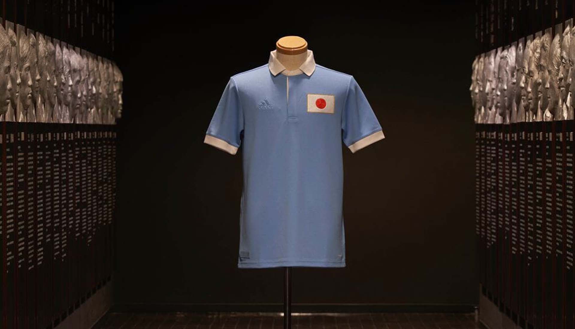
I don't know how I missed these beauties when they were (limited) released in 2021. I grabbed one from DHgate last month.
Japan's 100th anniversary jersey.

Japan's 100th anniversary jersey.

@dirtynine - Got the Clean Sheet USA sweater and it kills. Thanks!
And the yellow/red card will come in very handy.
And the yellow/red card will come in very handy.
like the colors, shirt is okay, wish they got more creative, but it's MLS so I guess not just being plain pink with trim is all you can ask for.The new StL kit. Really like the color.
This media contains sensitive content?!? I don’t love it, but that’s a bit harsh.The new StL kit. Really like the color.
The Fire’s secondary kit for 2023. Woof.
I do like the sky blue shorts with navy detailing. But that jersey? Hell no.
Rumor is that the primary kit has to has to stay navy blue again this season due to the Adidas contract, but will revert to classic red in 2024. Please don’t screw that up.
I do like the sky blue shorts with navy detailing. But that jersey? Hell no.
Rumor is that the primary kit has to has to stay navy blue again this season due to the Adidas contract, but will revert to classic red in 2024. Please don’t screw that up.
I think the jersey looks off due to missing the sponsorship logo?
The new Revs jersey is pretty great, with a twisting sash, although the sponsor logo breaks it up too much.
View: https://twitter.com/NERevolution/status/1625877217879240706?s=20
The new Revs jersey is pretty great, with a twisting sash, although the sponsor logo breaks it up too much.
View: https://twitter.com/NERevolution/status/1625877217879240706?s=20
Definitely can see buying a jersey based off that.
My youngest has an older Sounders jersey specifically because of the XBOX logo on the front.
My youngest has an older Sounders jersey specifically because of the XBOX logo on the front.
The blank space in the middle definitely hurts the overall design, but I just don't like the geometric shapes floating on white. If there's a symbolic reference in there, it's lost on me.I think the jersey looks off due to missing the sponsorship logo?
The new Revs jersey is pretty great, with a twisting sash, although the sponsor logo breaks it up too much.
View: https://twitter.com/NERevolution/status/1625877217879240706?s=20
Motorola's 3-year jersey sponsorship ended in 2022, no word yet on a replacement.
Love that look for the Revs. The color gradient twist, as you put it, is a really nice variation on a classic design.
See, I like it.The Fire’s secondary kit for 2023. Woof.
I do like the sky blue shorts with navy detailing. But that jersey? Hell no.
Rumor is that the primary kit has to has to stay navy blue again this season due to the Adidas contract, but will revert to classic red in 2024. Please don’t screw that up.
Looks like someone made a kit with an online design tool lolMy wife has a powerful crush on Duncan Ferguson, who just took over at League One (soon to be League Two) Forest Green Rovers. So getting one of these is pretty much mandatory now:
View attachment 61320
Man, maybe I'm just getting old but a lot of these modern kit trends just don't do it for me. Give me classic looks with extra attention to details and I'm happy. I'm more inclined to like an alternate design with clean lines than a snazzier version of a classic or just a mess of a shirt.
For example, Barca's third kit is a winner IMO:

I'd prefer a different primary color for the shorts just to break it up, but that shirt is a winner, and the socks have nice accent stripes.
Compare that to Tottenham's third strip:

That shirt is not doing it for me. Let's not even discuss Tottenham's away 'scuba' strip.
For example, Barca's third kit is a winner IMO:

I'd prefer a different primary color for the shorts just to break it up, but that shirt is a winner, and the socks have nice accent stripes.
Compare that to Tottenham's third strip:

That shirt is not doing it for me. Let's not even discuss Tottenham's away 'scuba' strip.
Where do we stand on the Thorns Ed Hardy kits?New Red Stars jersey hits hard. NWSL consistently drops great kits.
View: https://twitter.com/ThornsFC/status/1635724581477695489
Ooofff. On the nose.Where do we stand on the Thorns Ed Hardy kits?
View: https://twitter.com/ThornsFC/status/1635724581477695489
I dislike Ed Hardy as a brand, and the people that tend to wear it even more so, but call me crazy those are decent shirts!Ooofff. On the nose.
Are those Chicago Red Star kits featuring an athletic skirt, or is that just how they're showcasing the shirt? If the former, there's some strong 'A League of Their Own' vibes--not sure how to feel about it honestly. I like the idea of more interesting kit pieces (shoutout to the banned Senegal (?) onesie), but I'm not sure how female athletes would feel about it. That last piece would be dispositive on the issue for me, although that presumes there's a consensus.
LOL. That would be wild and probably not appreciated by many of the players. No skirt, kit has shorts.I dislike Ed Hardy as a brand, and the people that tend to wear it even more so, but call me crazy those are decent shirts!
Are those Chicago Red Star kits featuring an athletic skirt, or is that just how they're showcasing the shirt? If the former, there's some strong 'A League of Their Own' vibes--not sure how to feel about it honestly. I like the idea of more interesting kit pieces (shoutout to the banned Senegal (?) onesie), but I'm not sure how female athletes would feel about it. That last piece would be dispositive on the issue for me, although that presumes there's a consensus.
As a Thorns fan I like the shoulders and having the crest centered. If it were that with a collar of vines I'd like it.
But the dagger is horrible, particularly how they had to add the third star above it. Also "Rose City til I die" is a Timbers Army slogan, that doesn't belong on a Thorns kit. "By any other name" is the Thorns supporter slogan and should be the bigger/only one.
But the dagger is horrible, particularly how they had to add the third star above it. Also "Rose City til I die" is a Timbers Army slogan, that doesn't belong on a Thorns kit. "By any other name" is the Thorns supporter slogan and should be the bigger/only one.
Premier League to phase out gambling sponsorship logos for the front of jerseys by 2025/26 season. They will still be allowed on sleeves and signage.
Im trying to come up with a list of those affected, WHU, Everton, Newcastle, Wolves?
https://www.bbc.co.uk/sport/football/65260002
edit - Wolves moved from ManBetX to whatever AstroPay is.
Im trying to come up with a list of those affected, WHU, Everton, Newcastle, Wolves?
https://www.bbc.co.uk/sport/football/65260002
edit - Wolves moved from ManBetX to whatever AstroPay is.
Last edited:
Pretty sure the date is specifically because that's just after the longest of the deals (WHU w/ betway) expiresPremier League to phase out gambling sponsorship logos for the front of jerseys by 2025/26 season. They will still be allowed on sleeves and signage.
Im trying to come up with a list of those affected, WHU, Everton, Newcastle, Wolves?
https://www.bbc.co.uk/sport/football/65260002
edit - Wolves moved from ManBetX to whatever AstroPay is.
I like Australia (best of the new era), Nigeria (always brings it in the kit game), and Norway (clean, classic) the best. As well as NZ home (crushed).Pretty blah, especially for a WC.
Canada's home jersey is a bit more interesting. Still underwhelming.
Here's a thread with all the Nike designs. Meh.
But check some of the training gear. That's where it's at!
That will look great in domestic competition
Your Europa League words can no longer hurt meThat will look great in domestic competition
Seriously though, congrats @dirtynine and @Warning Track Speed . I have to offer my grudging respect for Brighton. It’s a pretty great accomplishment. I’m still holding a grudge against Union Saint-Gilloise though.
Hey thanks @candylandriots. It’s the dream for all the clubs like us, right? I’d definitely, hypothetically, pull for Palace in Europe (if only to tire them out for the PL, heh). And Union should keep you busy on the continent, right? Should be a fun one next year.Seriously though, congrats @dirtynine and @Warning Track Speed . I have to offer my grudging respect for Brighton. It’s a pretty great accomplishment. I’m still holding a grudge against Union Saint-Gilloise though.
Woo-hoo! Yeah thanks @candylandriots. Awesome season for BHA fans for sure, and not what I would have expected after Potter and the whole coaching staff decamped, Bissouma and Cucurella were sold, Trossard pouted his way out of town, etc. Modest start for de Zerbi but man were they a fun watch this spring. And so many young players, if they can keep the core intact (seems Mac Allister and possibly Caicedo are good as gone), could be some more fun on the horizon. Agree with my fellow Seagull fan that next season should be a good one for all of us. Cheers!


