Clay's been a regular starter since 2010 and in that time he's had three reasonably healthy seasons, a couple where he was very effective as long as he was pitching, a couple where he was decent but not great (ERA+ of 124 and 92), and one season (2014) where he was more or less healthy but just awful: ERA+ of 72, worst ERA in the league for qualifying pitchers, a little better but still pretty mediocre in terms of xFIP. What went wrong? What can we expect for 2015?
Short answer is that I have no idea, but maybe someone will have better ideas than me.
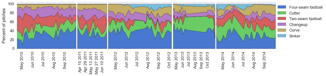
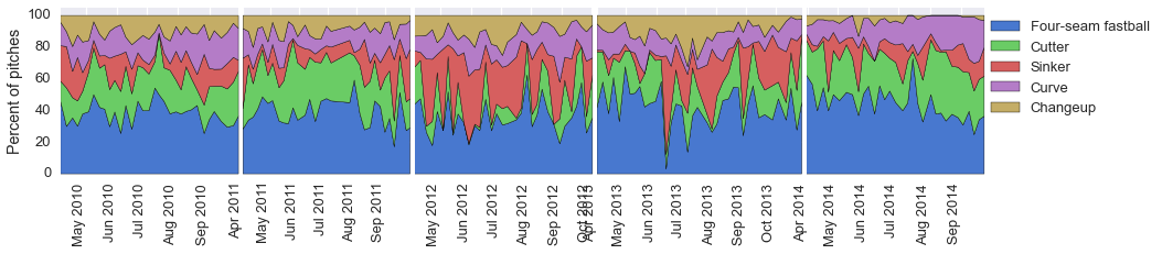
I looked at his pitch mix and effectiveness in 2014 vs 2013. Overall, his pitch mix was roughly similar, with a 4-seam and a cutter dominating. He used his curve relatively more in 2013, swapping his 2-seam for it in 2014, probably because his curve pretty much sucked in 2014. (I'm relying entirely on PitchFX for pitch identification here.)
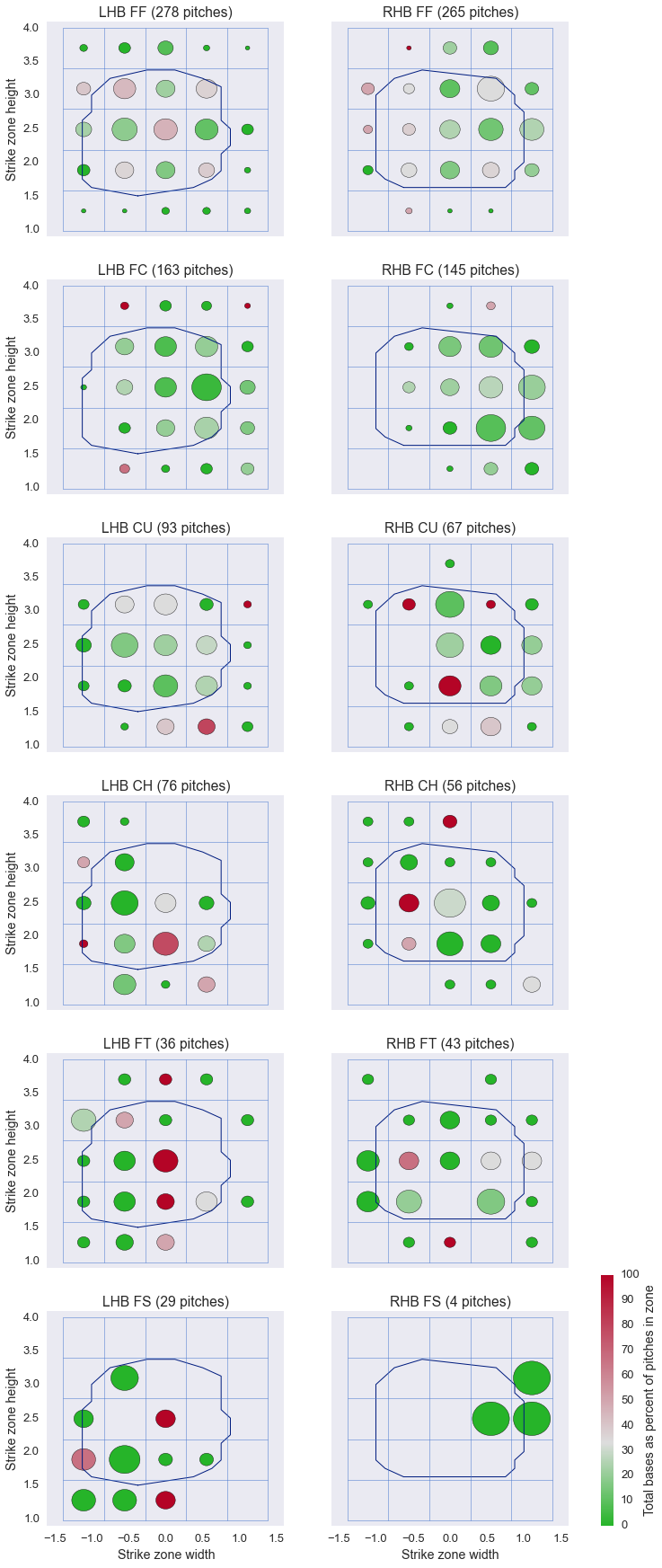
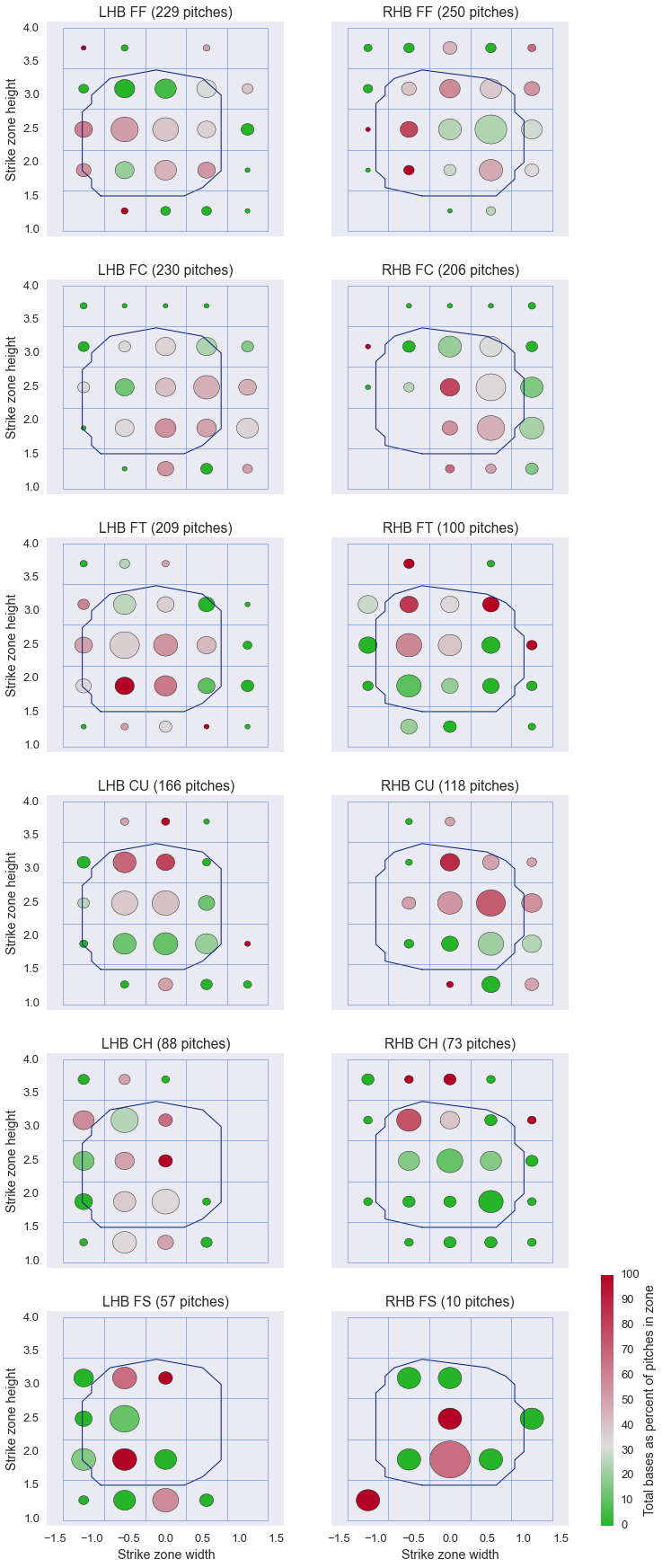
In these plots, the size of each bubble represents the proportion of pitches in each zone, and the color represents its effectiveness, based on total bases as a percent of pitches in each zone. Green is good, red is bad, grey is league average (overall, not for each sub-zone). These are based on pitches that are not balls, so it's showing the effectiveness of the pitch in either drawing bad contact, or fooling the batter into a called strike. The blue traces are the de facto strike zones for each year: Inside the lines a pitch has more than 50% chance of being called a strike, outside the lines a pitch is more likely to be called a ball.
2013:
 2014:
2014:
 (All his years since 2010 are shown here.)
His 4-seam didn't change all that much in effectiveness, and though his 2-seam isn't all that good it's not drastically worse in 2014 than in 2013. The biggest differences were in his curve and, especially, his cutter, which were both very effective pitches in 2013 and pretty bad in 2014.
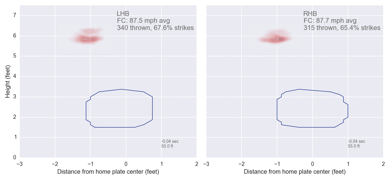
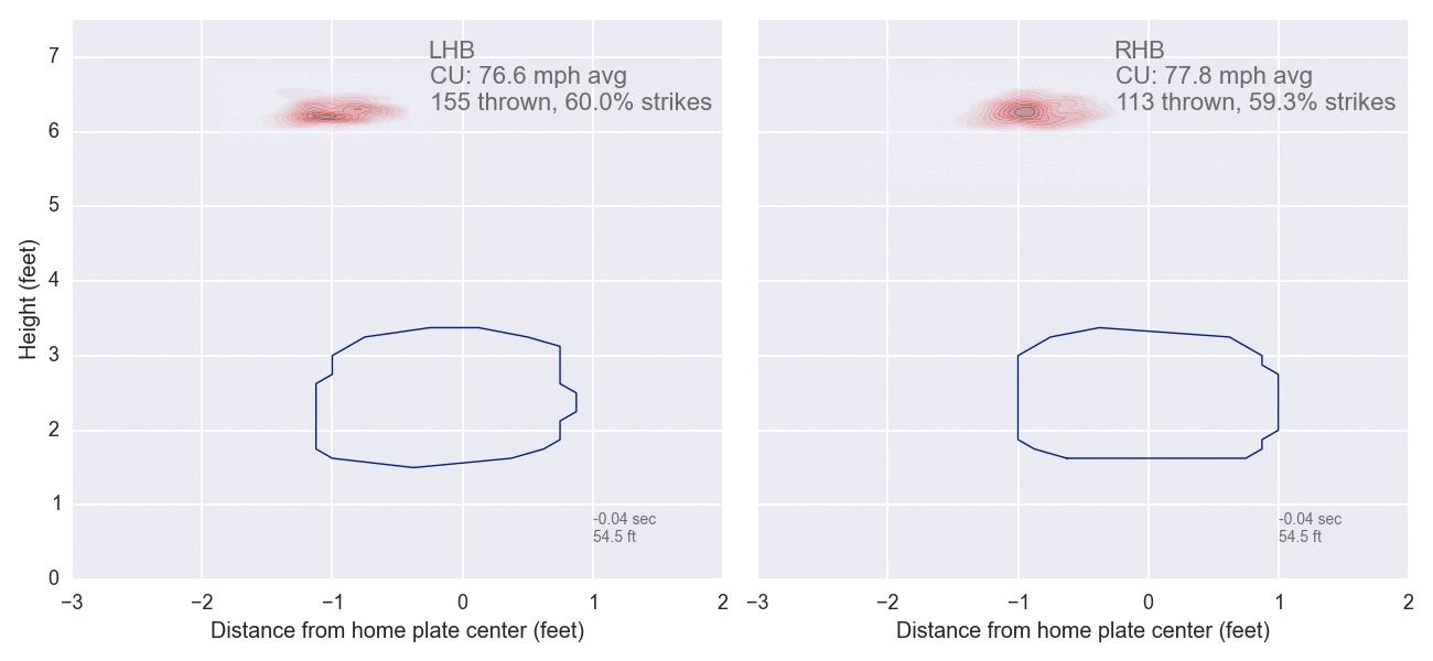
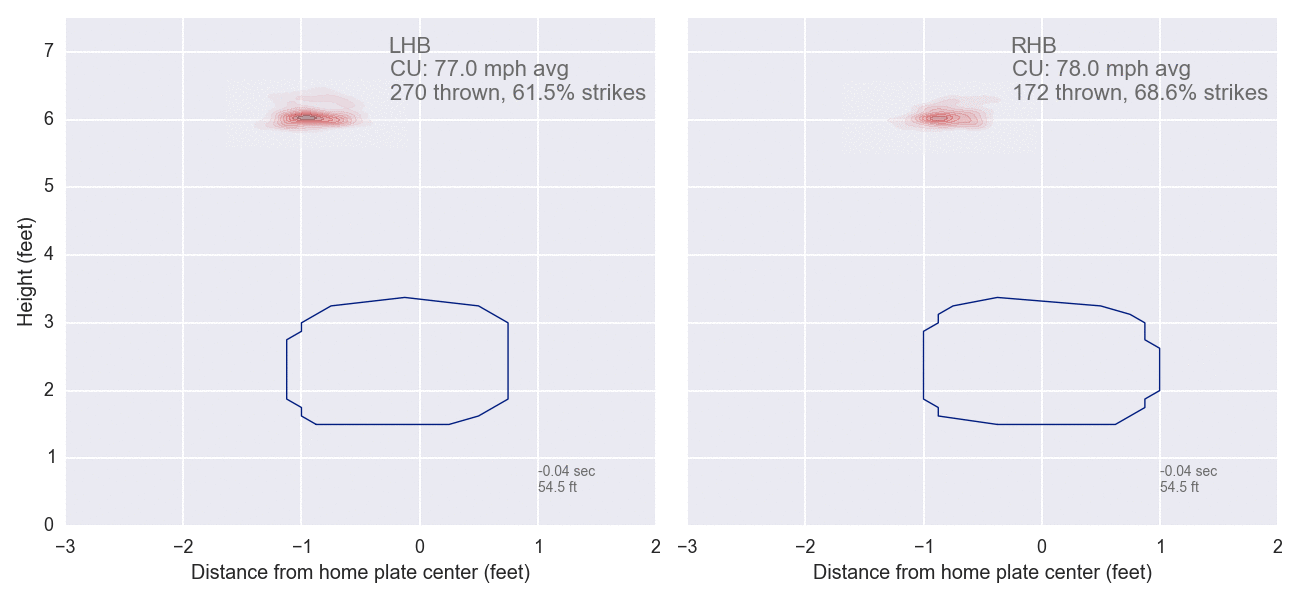
How did they look in each year? Here are animations of all his curves/cutters for each year.
Cutter, 2013:
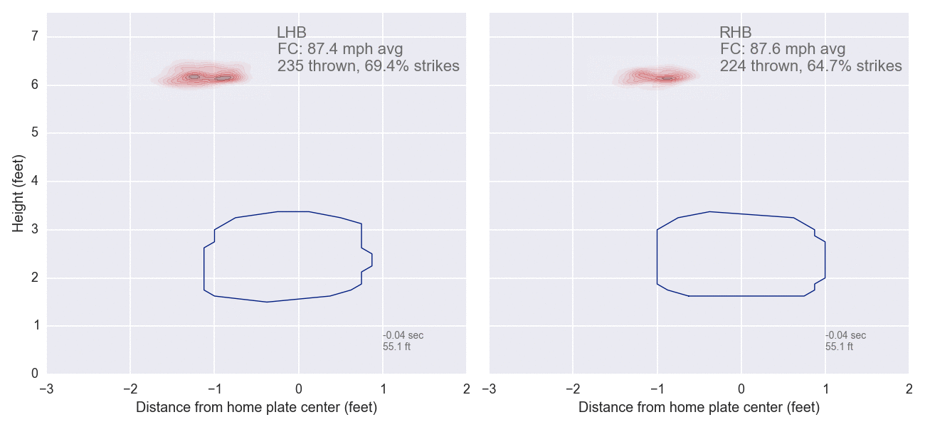 Cutter, 2014:
 Curve, 2013:
 Curve, 2014:
(links: all 2014 pitches; 2013 4-seam, 2-seam, change)
The most striking thing about these comparisons is how similar they are. Velocity is very similar (same with the other pitches I don't show here), and movement seems pretty similar too. To me, that's more encouraging than not: His pitches don't seem to have dramatically changed their quality from a time when they were highly effective, so there's no obvious reason why they can't be effective again.
There's only one thing that I do see as being rather different year to year, and that's the fact that in 2014 his pitches cluster a lot more tightly. Could he have simply been more predictable in 2014? I mean, I'd love to blame Pierzynski, and it's worth noting that before AJ was DFA'd Clay's xFIP was 5.11, while after August (when he and Vazquez should have been on the same page) his xFIP was 3.66. But I recognize I'm grasping at straws here.
Otherwise, nothing jumps out at me. Clay had an awful year in 2014, but I don't see an obvious reason why he should have another bad one in 2015. Nor, unfortunately, do I see a reason why he shouldn't have another bad one.
Short answer is that I have no idea, but maybe someone will have better ideas than me.
I looked at his pitch mix and effectiveness in 2014 vs 2013. Overall, his pitch mix was roughly similar, with a 4-seam and a cutter dominating. He used his curve relatively more in 2013, swapping his 2-seam for it in 2014, probably because his curve pretty much sucked in 2014. (I'm relying entirely on PitchFX for pitch identification here.)
In these plots, the size of each bubble represents the proportion of pitches in each zone, and the color represents its effectiveness, based on total bases as a percent of pitches in each zone. Green is good, red is bad, grey is league average (overall, not for each sub-zone). These are based on pitches that are not balls, so it's showing the effectiveness of the pitch in either drawing bad contact, or fooling the batter into a called strike. The blue traces are the de facto strike zones for each year: Inside the lines a pitch has more than 50% chance of being called a strike, outside the lines a pitch is more likely to be called a ball.
2013:
His 4-seam didn't change all that much in effectiveness, and though his 2-seam isn't all that good it's not drastically worse in 2014 than in 2013. The biggest differences were in his curve and, especially, his cutter, which were both very effective pitches in 2013 and pretty bad in 2014.
How did they look in each year? Here are animations of all his curves/cutters for each year.
Cutter, 2013:
(links: all 2014 pitches; 2013 4-seam, 2-seam, change)
The most striking thing about these comparisons is how similar they are. Velocity is very similar (same with the other pitches I don't show here), and movement seems pretty similar too. To me, that's more encouraging than not: His pitches don't seem to have dramatically changed their quality from a time when they were highly effective, so there's no obvious reason why they can't be effective again.
There's only one thing that I do see as being rather different year to year, and that's the fact that in 2014 his pitches cluster a lot more tightly. Could he have simply been more predictable in 2014? I mean, I'd love to blame Pierzynski, and it's worth noting that before AJ was DFA'd Clay's xFIP was 5.11, while after August (when he and Vazquez should have been on the same page) his xFIP was 3.66. But I recognize I'm grasping at straws here.
Otherwise, nothing jumps out at me. Clay had an awful year in 2014, but I don't see an obvious reason why he should have another bad one in 2015. Nor, unfortunately, do I see a reason why he shouldn't have another bad one.