Oooh that’s that is *nice*.The Men in Red are back! Well, at least the red home jerseys for the Fire are back with the appropriate sky blue piping. A classic kit, one that Klopas will feel at home with.
View attachment 77388
dirtynine's Digest - The Thread for Kits
- Thread starter Zososoxfan
- Start date
The Revolution home is horrible, but that just makes it easier for me to continue my perpetual boycott of the new logo. Crayon Flag forever, yo.
Made the decision to get a Gutierrez 17 jersey when these drop. Happy birthday to me.Oooh that’s that is *nice*.
Looks like some of the new MLS designs leaked. Austin, Charlotte and Seattle look like keepers to me (meaning good, not goalie attire).
View: https://twitter.com/RinconMLS/status/1751304597669318661
View: https://twitter.com/RinconMLS/status/1751304597669318661
Charlotte looks immaculate to me.Looks like some of the new MLS designs leaked. Austin, Charlotte and Seattle look like keepers to me (meaning good, not goalie attire).
View: https://twitter.com/RinconMLS/status/1751304597669318661
Also like the use of negative space with LA Galaxy’s sash. Looks pretty clean.
Good Grief this Columbus kit is something...
View: https://twitter.com/dunord/status/1757798334893302102?t=y07zpEuTnVAoL_doMGS3eQ&s=19
View: https://twitter.com/dunord/status/1757798334893302102?t=y07zpEuTnVAoL_doMGS3eQ&s=19
They nailed it.Made the decision to get a Gutierrez 17 jersey when these drop. Happy birthday to me.
View: https://twitter.com/chicagofire/status/1758305670984880248?s=46&t=GfuLFvTYcOxcFiCZjyIYZw
That's nice from Chicago. In general a single stripe across the chest like that is one of my favorite kit designs. The little bit of light blue to mimic the city flag is also great.
The new Sounders jersey is kind of a dog, but look at this slick jacket.
View: https://twitter.com/simplyseattle/status/1758177657072861556?s=46&t=GfuLFvTYcOxcFiCZjyIYZw
View: https://twitter.com/simplyseattle/status/1758177657072861556?s=46&t=GfuLFvTYcOxcFiCZjyIYZw
Last edited:
Great thread will all the new NWSL home jerseys.
View: https://twitter.com/alarmingsirens/status/1762560592341287062?s=46&t=GfuLFvTYcOxcFiCZjyIYZw
View: https://twitter.com/alarmingsirens/status/1762560592341287062?s=46&t=GfuLFvTYcOxcFiCZjyIYZw
There is a “leak” of the USMNT COPA kit jerseys for this summer. Home is basic white, simple so no big controversy. The away will be discussed though. I think maybe if it had more red they would be a bit better.
View: https://twitter.com/USMNTOtaku/status/1763368967463211332?s=20
View: https://twitter.com/USMNTOtaku/status/1763368967463211332?s=20
I read today that Nike has taken over the design work for all NWSL clubs, hence the large number of very bland kits this year. Apparently the league got a much better deal on the advance & royalty rate by doing this, which seems pretty close to the Adidas-MLS agreement.Great thread will all the new NWSL home jerseys.
View: https://twitter.com/alarmingsirens/status/1762560592341287062?s=46&t=GfuLFvTYcOxcFiCZjyIYZw
A big bummer because NWSL had a great batting average in recent years - many clubs worked with local designers and got local flair and new ideas that Nike rarely produces for their clubs.
Exactly my thoughts. There's a perfectly good navy in the lettering of of the crest, but they don't go that route without it being marbled or acid washed, etc.I will never understand the royal blue as opposed to navy
Honestly, the bar was so low after the weird upside-down collar and center crest from the last cycle that this will unfortunately pass for a massive improvement. Lines them right up to be sponsored by Pepsi or Carnival Cruise Line.
I wish they could have worn the Jackson Pollack USWNT kits. They needed a bit more red, but liked those a lot. I think the men only used them as a training top.
I think both of these are above average for USMNT kits. What that says about the average USMNT kits I will leave as an exercise to the reader.
The collar and arm stripes on the whites are pretty cool.
But again, the collar is royal and not navy.
But again, the collar is royal and not navy.
IMO they vacillate between royal and navy so there’s usually a “pop” to the newest look. After leaning on navy for a while, then new kits with royal blue hit harder, and vice versa. Same with pure white vs. vintage/cream white. They’ve used different reds at times, but that stays more consistent.
I don’t mind the royal blue use in general, it’s very 80s Captain America. But the home whites in this leak win for me. Don’t want the tie dye.
I don’t mind the royal blue use in general, it’s very 80s Captain America. But the home whites in this leak win for me. Don’t want the tie dye.
I’m with you 100% on the whites. They’re decent enough and the collar/arm stripes are nice.The collar and arm stripes on the whites are pretty cool.
But again, the collar is royal and not navy.
I wish US Soccer would ask Nike to give them whatever team is designing the Nigeria kits, but I imagine part of the problem is some suits at the fed want to play it safe. Every. Damn. Time.
Belgium went with a Tin Tin tribute for Euro away kit. Not sold on the brown, but it’s a nice tribute.

https://www.tintin.com/en/news/6069/tintin-inspired-away-kit-homage-to-cartoonist-herge#
https://www.tintin.com/en/news/6069/tintin-inspired-away-kit-homage-to-cartoonist-herge#
Last edited:
Here’s a fun & honkers project to follow - a guy mocking up kits for each Chicago neighborhood, all 77 of them. He’s 4 in so far, all good quality IMO.
View: https://twitter.com/patnw_/status/1734233430697603531?s=46&t=GfuLFvTYcOxcFiCZjyIYZw
View: https://twitter.com/patnw_/status/1734233430697603531?s=46&t=GfuLFvTYcOxcFiCZjyIYZw
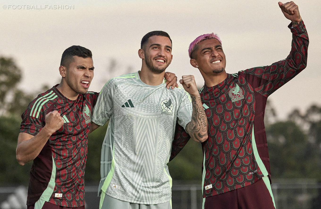
Last night was the first time seeing the new USMNT kits. I’d give them a solid B, a massive upgrade from the previous kits, which were maybe the worst ones in USMNT history.
Glad they went back to something cleaner, and this is the closest we’ve come to bringing back the bomb pop kit.
Glad they went back to something cleaner, and this is the closest we’ve come to bringing back the bomb pop kit.
I liked them more than I thought I would. I’m still with @tims4wins in preferring navy blue and I’d rather the red be a deeper shade, more in line with the flag. That being said, I’m hardly the target demographic.
I hope we get to see the whites on Sunday. I like those.
I hope we get to see the whites on Sunday. I like those.
That is so fucking cool.Belgium went with a Tin Tin tribute for Euro away kit. Not sold on the brown, but it’s a nice tribute.
View attachment 79455
https://www.tintin.com/en/news/6069/tintin-inspired-away-kit-homage-to-cartoonist-herge#
I might be in the minority, but I love the brown. It looks gorgeous with that shade of blue.
I saw an image of the u-21s (or someone) wearing the new US jersey, but with blue shorts and socks. Looks much, much better (though still kinda lame) than on red/red

Not a big fan of the new iteration of the home Argentina NT kit.
I'm generally not a big fan of designs that rely heavily on coordination between items (i.e., continuation of lines between shirt and shorts, or short and socks), but even more so, the Argentina kit always needs some black trim to really pop. I even like the recent kits that feature white shorts, but these are just kinda bland. As an aside, did FIFA reverse course on requiring kits to only feature 2 colors, because that was a sartorial travesty. I think they must've based on France's blue shirt-white shorts-red socks tricolor strip, which is fantastic.
Argentina plays Costa Rica tonight and maybe they'll wear the away kit. It looks OK, but I prefer when the blue is darker, almost navy.
Adidas really had some bangers for the Euros, I can't believe they let the WC champs down like that.
I had to remind myself of the symbol and it is not fucking subtle. That is absolutely intentional.
Fake edit…
It’s a customized shirt. Got it. Adidas didn’t advertise it that way.
That font is used with other teams.
Unfortunate, but not intentional.
Though I bet they sell a few, even if 44 isn’t a real jersey number.
It’s a customized shirt. Got it. Adidas didn’t advertise it that way.
That font is used with other teams.
Unfortunate, but not intentional.
Though I bet they sell a few, even if 44 isn’t a real jersey number.
They've announced they will redesign the #4 on the Germany shirts, and Adidas has blocked the #44 from being available to buy in the customization options.

Those guys always get subbed out.Those look sharp. At least they didn’t go for all red.
Although it pains me greatly to say it, the new Boca shirts with an homage to it's genesis are straight fire:

Leyton Orient with a great tribute kit in memory of 3 players killed in WW1.

https://www.dailymail.co.uk/sport/football/article-6294277/Leyton-Orient-unveil-stunning-fourth-kit-red-chevron-nod-clubs-role-World-War-I.html
https://www.dailymail.co.uk/sport/football/article-6294277/Leyton-Orient-unveil-stunning-fourth-kit-red-chevron-nod-clubs-role-World-War-I.html
Really like that shirt. Sharp, classic look with good attention to details.Leyton Orient with a great tribute kit in memory of 3 players killed in WW1.
View attachment 80889
https://www.dailymail.co.uk/sport/football/article-6294277/Leyton-Orient-unveil-stunning-fourth-kit-red-chevron-nod-clubs-role-World-War-I.html
As I've said repeatedly over the years, I'm a sucker for classics and clean lines. But this is good, and the collar is exceptional. They should've added a yellow ring to the end of the sleeve, but I'll excuse the oversight [/amateurdesigner].Rumored look for Brighton next year. I’m evolved enough to say I dig it.
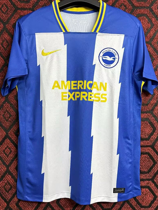
I think you're right. That matching ring on a sleeve can be an incredible detail.As I've said repeatedly over the years, I'm a sucker for classics and clean lines. But this is good, and the collar is exceptional. They should've added a yellow ring to the end of the sleeve, but I'll excuse the oversight [/amateurdesigner].
This is one of my all time favorite Italy kits (what the fuck happened to you, Nike?), and the collar/sleeve is fantastic.
