and ripped denim shorts? Would buy several kits.The Sounders should make a flannel top.
dirtynine's Digest - The Thread for Kits
- Thread starter Zososoxfan
- Start date
These guys have had it for a while. Can't speak to this shirt but the other shirts are quite comfortable. Limited sizes available now but still available. Good guys who run the thing too.
https://www.streakersports.com/collections/soccer-collection/products/94-usa-denim-soccer-jersey
https://www.streakersports.com/collections/soccer-collection/products/94-usa-denim-soccer-jersey
Not trying to steal anyone's thunder here, I just don't know how to copy a post from another thread. Here's a preview of MLS kits for the upcoming season:
https://www.si.com/soccer/2020/02/06/mls-uniforms-kit-reveal-2020-season-jerseys-25-anniversary
First and foremost, I really dislike the asymmetrical shoulder stripe template. I assume that's mandatory? So dumb. Also, not sure if it's the article or the clubs, but some of these kits were photographed terribly. My favorites below:
- Chicago - diagonal design elements are hard to pull of IMO, but the thin lines work.
- Cincy - another hard concept pulled off well - two shades of the same color.
- NYFC - same theme here, those polygon pseudo 90s designs are inherently bad, but this is wonderful.
- Portland - Love the thick trim with thin lines contrast. There should be more trim on the shorts, but I'm picking nits.
- KC - I like the polka dots, but would like to the full kits.
- Nashville - Hard to get yellow-black wrong.
View: https://twitter.com/SouthsideTrapod/status/1256014485610995712
Chicago Red Stars continue to kill it with great kits
Chicago Red Stars continue to kill it with great kits
The blue stripes are made up of the neighborhood names = they know their audience so well. Chef's kiss on this one.View: https://twitter.com/SouthsideTrapod/status/1256014485610995712
Chicago Red Stars continue to kill it with great kits
Forward Madison continues to just obliterate the competition on kits:
View: https://twitter.com/ForwardMSNFC/status/1264239671023931393
View: https://twitter.com/ForwardMSNFC/status/1264239671023931393
Good place to mention: Harry Kane purchased the shirt sponsorship for Leyton Orient (where he made his pro debut). Dontaing the sponsorships to 3 charities, who will receive part of the proceeds from shirt sales. Class act, Harry.

Ok that's amazing. I dislike Spurs but that's like the time PK Subban donated all that money to the Children's Hospital. It's so easy to dislike star players on rival teams then they do stuff like this and you're like oh he's a good guy. Damnit.Good place to mention: Harry Kane purchased the shirt sponsorship for Leyton Orient (where he made his pro debut). Dontaing the sponsorships to 3 charities, who will receive part of the proceeds from shirt sales. Class act, Harry.
I was trying to come up with a good diving joke, but I’ll give Kane this one. Class.Ok that's amazing. I dislike Spurs but that's like the time PK Subban donated all that money to the Children's Hospital. It's so easy to dislike star players on rival teams then they do stuff like this and you're like oh he's a good guy. Damnit.
Meanwhile in MLS: "we're excited to announce that Adidas has rolled out new home kits for each club, all based on the same basic template. Also, everyone's away kit is a white t-shirt."Forward Madison continues to just obliterate the competition on kits:
View: https://twitter.com/ForwardMSNFC/status/1264239671023931393
View: https://twitter.com/WestHam/status/1277498283804549120
West Ham 125th anniversary home kit. It's pretty decent. I like going to one color on the crest, however... the font and spacing on the crest are still garbage (where it says West Ham United).
West Ham 125th anniversary home kit. It's pretty decent. I like going to one color on the crest, however... the font and spacing on the crest are still garbage (where it says West Ham United).
They're playing to the base of old-timers who get super angry with anything non-traditional. Legitimately hundreds of posts on message boards about Claret socks instead of white, or how if it isn't claret with blue sleeves it isn't a west ham kit.I’d expect better for the 125th commemoration. Meh.

Nowhere near Iceland, but I actually like this Spurs 4th kit for nest season (surprised I hadn't already posted):

Based on Nike Air Max 95

Based on Nike Air Max 95
Gonna be hard for anyone to beat this for worst top tier league kit of the year:
View: https://twitter.com/WestHam/status/1284021265343209472
That a professional designed this is embarrassing.
View: https://twitter.com/WestHam/status/1284021265343209472
That a professional designed this is embarrassing.
I've always thought West Ham had one of the worst badges in soccer because it highly resembles the logo my father made for his vacation home, right down to the location listed on the bottom. Is there any question about where a team that plays in London Stadium is located?
I don't love the London, but if they would just fix the West Ham United part at the top and go with the one color like on the home kit I think it's a great crest. the crossed Hammers is a very recognizable symbol and good branding if they kept it simple.I've always thought West Ham had one of the worst badges in soccer because it highly resembles the logo my father made for his vacation home, right down to the location listed on the bottom. Is there any question about where a team that plays in London Stadium is located?
That kit doesn’t seem remarkably bad at all to me tbh. There will be a half dozen worse in the Prem alone
Assuming the don't get relegated next week.Gonna be hard for anyone to beat this for worst top tier league kit of the year:
View: https://twitter.com/WestHam/status/1284021265343209472
That a professional designed this is embarrassing.
Nah, I trust the bottom 3 to be shit. Though we might well know by 5 today, a win over Watford basically seals it, even a point makes it pretty close (4 points up with 2 to play for everyone and a +10 and +12 GD)Assuming the don't get relegated next week.
So what y’all think about this Southampton jersey?
Attachments
-
 78.1 KB Views: 20
That can't possibly be real. Their other kits are actually pretty good:So what y’all think about this Southampton jersey?
I love, love, love the sash. Palace often has one.
Re: West Ham: I like the claret-and-sky-blue color combo. It's underrepresented in American sports (anyone else besides the Avalanche?). But there are three in the PL right now and that's too many.
Re: West Ham: I like the claret-and-sky-blue color combo. It's underrepresented in American sports (anyone else besides the Avalanche?). But there are three in the PL right now and that's too many.
I think there are only 4 claret and blue teams in England total, and 3 are in the PL.I love, love, love the sash. Palace often has one.
Re: West Ham: I like the claret-and-sky-blue color combo. It's underrepresented in American sports (anyone else besides the Avalanche?). But there are three in the PL right now and that's too many.
I can't confirm the stories, but I read that Burnley and West Ham only wear the colors because of Villa. Burley adopted the Villa kit after Villa won its 6th title in 1910, and apparently West Ham review a set of Villa kets as a payment for a bet, and chose to wear them. (Again, unconfirmed)
It is a fantastic color combo (claret/sky blue), but WHam's heavy leaning on the sky blue is terrible.
Don't worry, Aston Villa has a solution in the works for that problemI love, love, love the sash. Palace often has one.
Re: West Ham: I like the claret-and-sky-blue color combo. It's underrepresented in American sports (anyone else besides the Avalanche?). But there are three in the PL right now and that's too many.
The Rapids ditched green and gold a decade or so ago and wear those colors too (same ownership as the Avalanche)
Oh, those are really nice. The gold sponsor logo on the white is very slick.That can't possibly be real. Their other kits are actually pretty good:

But isn’t the rule that of the home & away are good, the 3rd must be trash?
Last edited:
Actually those are the home and the 3rd, so the away one will be the trash one.Oh, those are really nice. The gold sponsor logo on the white is very slick.
But isn’t the rule that of the home & away are good, the 3rd must be trash?
Very much agreePosting this here because it’s intriguing. Would love to see more.
+1
Here's a look at where I'm at. It should be said, I'm a white guy, and often a dumb one of those as well. I'm doing my best to channel what I understand into visuals. If I'm missing the mark, I'd jump at the chance to be told that. Especially from anyone/everyone in the Black community, people of color, or anybody with better insight than me. I hope to be as strong an ally as there can be, but I can't claim to speak for any group. BLM has inspired me, and I hope that comes through. Please - let me know (here, privately, however) if/how I'm off.
The idea starts with, inverts, and subverts the US flag. Stripes of brown and black stand in for red and white. The traditional charge of blue with white stars is instead black with brown "X" marks to indicate lives affected (and lost) by injustice. Red gradients indicate struggle, passion and conflict. An amazing MLK quote is inset into the inner neck: "Lightning makes no sound, until it strikes." If we're able to ramp this up, I'll put a fuller design story together for sure. It's also really important to make this a charitable, community-focused thing if becomes real. I'd love to write a big check to BLM or another worthy organization.
Anyway, this isn't anywhere yet. I want to be sure I have it right. But feedback of any kind is always hugely welcome.
It's gorgeous. I don't have any feedback, but it may be good to reach out the organization that you would want to donate to and get their input. Or even Black folks who are in the field, like Warren Creavalle. Keep us posted. I don't want to miss out on this like I did with the CF97 "The Will."Here's a look at where I'm at. It should be said, I'm a white guy, and often a dumb one of those as well. I'm doing my best to channel what I understand into visuals. If I'm missing the mark, I'd jump at the chance to be told that. Especially from anyone/everyone in the Black community, people of color, or anybody with better insight than me. I hope to be as strong an ally as there can be, but I can't claim to speak for any group. BLM has inspired me, and I hope that comes through. Please - let me know (here, privately, however) if/how I'm off.
View attachment 32783
The idea starts with, inverts, and subverts the US flag. Stripes of brown and black stand in for red and white. The traditional charge of blue with white stars is instead black with brown "X" marks to indicate lives affected (and lost) by injustice. Red gradients indicate struggle, passion and conflict. An amazing MLK quote is inset into the inner neck: "Lightning makes no sound, until it strikes." If we're able to ramp this up, I'll put a fuller design story together for sure. It's also really important to make this a charitable, community-focused thing if becomes real. I'd love to write a big check to BLM or another worthy organization.
Anyway, this isn't anywhere yet. I want to be sure I have it right. But feedback of any kind is always hugely welcome.
Design update... (I'm solidly in the editing/tweaking phase on this one; I may share another draft or two. Sorry for the dive inside my process!)
The stripes are now treated more consistently. The browns are also more varied to reflect a range of tones. The ×'s are a little thicker. And I've updated the quote in the neck to a new MLK remark I feel is an even better fit:
> I HAVE BEGUN THE STRUGGLE, AND I CANNOT TURN BACK
The stripes are now treated more consistently. The browns are also more varied to reflect a range of tones. The ×'s are a little thicker. And I've updated the quote in the neck to a new MLK remark I feel is an even better fit:
> I HAVE BEGUN THE STRUGGLE, AND I CANNOT TURN BACK
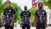
Heres Forward Madison’s BLM training jersey for the season, proceeds going to the local YWCA.Design update... (I'm solidly in the editing/tweaking phase on this one; I may share another draft or two. Sorry for the dive inside my process!)
View attachment 32820
The stripes are now treated more consistently. The browns are also more varied to reflect a range of tones. The ×'s are a little thicker. And I've updated the quote in the neck to a new MLK remark I feel is an even better fit:
> I HAVE BEGUN THE STRUGGLE, AND I CANNOT TURN BACK
I guess it comes from being a small club with no expectations or "history" but seriously Forward Madison's design team is amazing. Some big league clubs need to start taking chances, you'll draw more people in than old dudes you lose because the kit wasn't one of the 3 variants you've been cycling for decades.

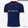
Juventus brought the stripes back. It’s incredible how awful the last kit was.
What's even more bizarre is that the marketing behind this is heavy on "stripes" and "identity." It's almost like a tacit admission of what a fuckup the half and half was.
I mean good on them for owning it was a colossally dumb move.
Juventus brought the stripes back. It’s incredible how awful the last kit was.
What's even more bizarre is that the marketing behind this is heavy on "stripes" and "identity." It's almost like a tacit admission of what a fuckup the half and half was.