dirtynine's Digest - The Thread for Kits
- Thread starter Zososoxfan
- Start date
Interesting concept, but agree that it's too clever by half. A lot of those elements are really cool, but there's just too many of them.
If I didn't know better, I would guess that this is @dirtynine's project:

The colors have a twofold meaning: One, they are the colors of the team (duh). Two, they are the color of the US flag, Boston having been one of the most important locations in the American Revolutionary War. The eight stars represent the Sox eight World Series wins. The circle containing the logo represents a baseball, and the sport in general, and the cross on the background represents the Catholic roots of the city.
My other favorite:

MIAMI MARLINS The arrangement of the flag is inspired by the official flag of Miami, with the Marlins' logo replacing the seal of the city in the middle of the tricolor. The colors are the team logo colors with an attempt to put them in a similar arrangement to the logo. They also represent a blue ocean with the sun rising (yellow sun, orange sky). The two stars represent the Marlins' victories in the World Series!
Anyone who can make the Marlins branding concepts attractive deserves a medal.
Edit: If someone wants to x-post this into the Main Board, please do so. I didn't know where it belonged (General MLB Discussion?).
The colors have a twofold meaning: One, they are the colors of the team (duh). Two, they are the color of the US flag, Boston having been one of the most important locations in the American Revolutionary War. The eight stars represent the Sox eight World Series wins. The circle containing the logo represents a baseball, and the sport in general, and the cross on the background represents the Catholic roots of the city.
My other favorite:
MIAMI MARLINS The arrangement of the flag is inspired by the official flag of Miami, with the Marlins' logo replacing the seal of the city in the middle of the tricolor. The colors are the team logo colors with an attempt to put them in a similar arrangement to the logo. They also represent a blue ocean with the sun rising (yellow sun, orange sky). The two stars represent the Marlins' victories in the World Series!
Anyone who can make the Marlins branding concepts attractive deserves a medal.
Edit: If someone wants to x-post this into the Main Board, please do so. I didn't know where it belonged (General MLB Discussion?).
I'm hesitant to put this here, but hey - my name's on the thread. My apparel shop (Clean Sheet Co.) is making a jersey for American fans. It's a from-scratch project - we're designing the patterns, sourcing the fabric, etc. We're doing a pre-order campaign to fund it. You can read about why, and see the design, here. We'll be doing a big push next week, but things are kind of in a soft launch phase now. Happy to answer any questions if any crop up.
Sounds like a campaign stretch goal!Does this kit have a picture of a man crying into his beer in front of a blank TV?
Yeah, I've been trying to say that without saying it. (I'm the president and I'm also a member.)Does fan focused fit mean its for fat people? Cause if so I'll order one.
Thank you!! This is a big leap for us, so the support at this early stage incredibly welcome.You’re being modest. That thing is gorgeous. Put in my pre-order, can’t wait.
Looks very cool. I hope this does awesome so you can do walkout jackets next. USMNT ones suck almost as much as the kits.
This is great riff off of my favorite USMNT jerseys of all time, the Waldos. I'm in.
I'm not sure what their rules are about advertising, but you should really find a way to spread the word on BigSoccer and r/mls. If there's a way I can help, PM me.
I'm not sure what their rules are about advertising, but you should really find a way to spread the word on BigSoccer and r/mls. If there's a way I can help, PM me.
Thank you all so much. TB/all, I'll gladly take any and all help I can with promotion. I'm working with a bunch of American Outlaw groups as well, and I'm hoping to get some coverage in what is left of American soccer media these days (different topic).
I'm extending a deal to AO folks - if orders from a specific chapter get to 15 total, we''ll commit to putting their logo / patch on the sleeve (many of these groups have patches), and we'll donate $100 to their charity of choice.

I'd be happy/thrilled to offer Sosh denizens the same deal. Not that you'd want a Sosh patch (or that those even exist) but I'll queue up the Jimmy Fund for sure.
I'm extending a deal to AO folks - if orders from a specific chapter get to 15 total, we''ll commit to putting their logo / patch on the sleeve (many of these groups have patches), and we'll donate $100 to their charity of choice.
I'd be happy/thrilled to offer Sosh denizens the same deal. Not that you'd want a Sosh patch (or that those even exist) but I'll queue up the Jimmy Fund for sure.
So the World Cup kits are slowly being released, and thankfully it seems FIFA has backed off some of there regulations that made most of the 2014 kits so monochromatic. (Also, I'm so glad that England dropped that stupid Nike template). For a quick glance at some of the kits: http://www.historicalkits.co.uk/FIFA_World_Cup/2018/2018-index.html
@dirtynine - I got the email that you missed your threshold for the jersey. Wicked bummah (as they say back east). But please keep us posted. I'd love to have one of these beauties.

Poor Leeds. Their old badge was bad for old reasons (shadows turned up to 11 - lit from the bottom for some reason, as if by campfire - and all kinds of weighting issues.) All they had to do was put the white rose in a decent container or even let it stay by itself. Instead they went with a 2002 vector-trace special.
I actually see the kernel of a decent idea here, something worth exploring, but the designer at some point must have realized it was a dead end. I can't believe they pushed through with it.
Though there is some possible merit to Newcastle exploring this direction...
I actually see the kernel of a decent idea here, something worth exploring, but the designer at some point must have realized it was a dead end. I can't believe they pushed through with it.
Though there is some possible merit to Newcastle exploring this direction...
Just bring back the 80s badge:Though there is some possible merit to Newcastle exploring this direction...

Those are great. Most kits like this will look awful, but for a city like LV or Miami, I like the neon-80s look. Also love the England Red kit. I never like a full whitewash, so I like the blue shorts, although I think some black would look sharp too.LasVegas Lights went with the face inside the jersey when you pull it over your head....
Parma's phoenix club got their third straight promotion and will compete in Serie A this year. The club released a cool third kit and apparently it has already sold out. Parma have some of my favorite kit designs of all time (the color palate is hard to beat), so I'm not surprised.
http://www.espn.co.uk/football/club/parma/115/blog/post/3575434/parma-mark-serie-a-return-with-stunning-new-kit-that-sells-out-in-24-hours
The new third kit:
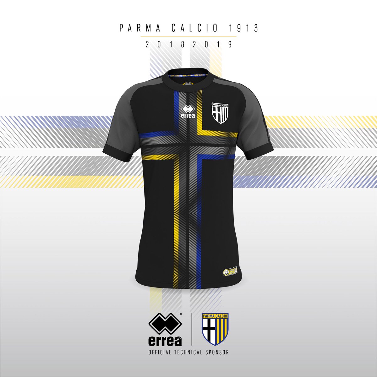
Some of my old favorites:


http://www.espn.co.uk/football/club/parma/115/blog/post/3575434/parma-mark-serie-a-return-with-stunning-new-kit-that-sells-out-in-24-hours
The new third kit:
Some of my old favorites:

Hah, they're my favorite of the bunch. (except Nigeria home, but those aren't new)The French alternates are horrific.
Nigeria is gonna have to keep that kit for a decade.
I wish we had stuck with the hoops. I also wish I had gotten one of those centennial kits and never managed to find one will have to snipe one on eBay some day
I wish we had stuck with the hoops. I also wish I had gotten one of those centennial kits and never managed to find one will have to snipe one on eBay some day
Same. Damn, another one I'll have to bid against.I also wish I had gotten one of those centennial kits and never managed to find one will have to snipe one on eBay some day

And, on the opposite end of the spectrum, we see Nike losing their fucking minds with this commemorative shirt to mark the end of their collaboration with City.

Looks more like a "fuck you" from Nike to City for dropping them. Yowsahs.
It would probably look better if Nike had not given City 9 years of mediocre to bad kits.
Hopefully Puma does better and only leaves me needing to shed 30 pounds to fit into one marked my size
Hopefully Puma does better and only leaves me needing to shed 30 pounds to fit into one marked my size
The womens kits are inoffensive for the most part (away France are abominable) but also boring. It's like they turned back the clock to the 80s with upgraded materials.
Also, Argentina's kits weren't horrible, but they were not good either. Just blah, much like their gameplay.
Also, Argentina's kits weren't horrible, but they were not good either. Just blah, much like their gameplay.
New primary jersey for the Chicago Red Stars. The Red Stars consistently have excellent kits (as opposed to the Fire...what the fuck are they doing?) and this one is making a big splash on twitter with Chicago folks. I don't know of any other city whose citizens love their flag and their map so damn much.

Last edited:
The flag is legit and Chicago's love of it is cool, but the obsession with the map is dumb and this makes for a dumb kit concept IMO. Barca did something kinda similar, and with the urban city planning of Barca (i.e. the Eixample), it could've been done well, but it was still bad.New primary jersey for the Chicago Red Stars. The Red Stars consistently have excellent kits (as opposed to the Fire...what the fuck are they doing?) and this one is making a big splash on twitter with Chicago folks. I don't know of any other city whose citizens love their flag and their map so damn much.
And while Chicago wins the award for city that most loves it flag, there are some state flags that get a lot of deserved love. I'm thinking specifically of Colorado and California. Texas and Maryland deserve mention here too. Arizona should definitely come up with some kit concepts integrating their flag.
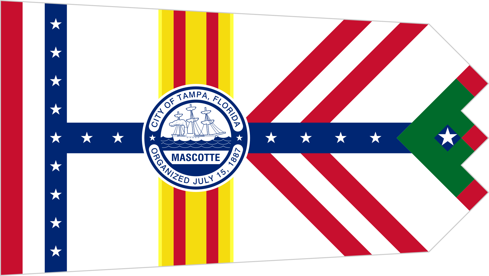
Speaking of city flags, I'm posting Tampa's below because it is such a unique monstrosity.
And Barca's 'Eixample' shirt:

https://www.google.com/imgres?imgurl=https%3A%2F%2Fupload.wikimedia.org%2Fwikipedia%2Fcommons%2Fthumb%2F2%2F20%2FFlag_of_Tampa%252C_Florida.svg%2F2000px-Flag_of_Tampa%252C_Florida.svg.png&imgrefurl=https%3A%2F%2Fen.wikipedia.org%2Fwiki%2FFlag_of_Tampa%2C_Florida&docid=8pw_Upqavg7oWM&tbnid=3d7nIZdoQuTucM%3A&vet=10ahUKEwiKn6ah1dLhAhWBpFkKHX3dDqIQMwhVKAAwAA..i&w=2000&h=1130&bih=917&biw=1829&q=tampa%20city%20flag&ved=0ahUKEwiKn6ah1dLhAhWBpFkKHX3dDqIQMwhVKAAwAA&iact=mrc&uact=8
Forward Madison has existed for less than a year and is only in D3, but they are already the best club in America.
When your shirt is famous for vertical stripes, shouldn't your new one have, you know...stripes?
I’m guessing you didn’t see the new Juve kits.When your shirt is famous for vertical stripes, shouldn't your new one have, you know...stripes?
I did, and while I didn't like them, at least you can loosely classify the half black, half white as having two extra-wide stripes. Barca going with the checkerboard is worse, in my opinion.I’m guessing you didn’t see the new Juve kits.