Padres fan unveils the best uniforms in baseball
- Thread starter Corsi
- Start date

Laser Show said:Where are you seeing that these are the new uniforms? Where'd those pics come from?
Crap. They were getting passed around twitter over the past 20 minutes or so, but it looks like they originated from someone's twitter that describes himself as a "VFX artist."
Unfortunately, I don't think these are legit. Bummer.
I'll edit.
People should flood the Padres' Twitter account with this. Maybe it will stick.
http://twitter.com/padres
http://twitter.com/padres
I've read that a majority of people IN Sand Diego prefer to blue/sand look to the brown/gold look--I don't know the splits, but from what I understand it was about 5-10% more. I believe that the Padres organization has done a study on this and have found that the minority that like the brown shirts are a very vocal minority, which is why they haven't completely changed the uniforms.
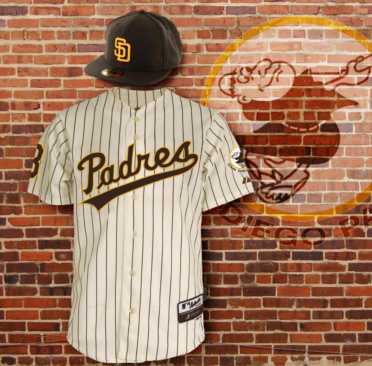
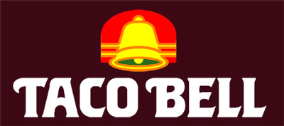
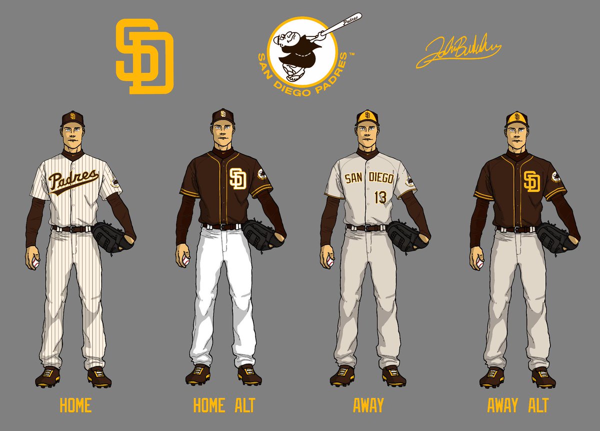
The home jerseys above look great, but as a kid I always hated the Taco Bell style, I was pumped when they went to a tradition blue/orange/white set. In the above example, they need a better away jersey. The brown one with the interlocking SD looks good as an alternate.
The home jerseys above look great, but as a kid I always hated the Taco Bell style, I was pumped when they went to a tradition blue/orange/white set. In the above example, they need a better away jersey. The brown one with the interlocking SD looks good as an alternate.
Nope. I meant Taco Bell
Though I know Ray Kroc owned the Pads and that obscure Scottish restaurant.
Though I know Ray Kroc owned the Pads and that obscure Scottish restaurant.
No. Really? Everyone on the Chris Creamer and Paul Lukas board calls them the Taco Bell Padres.
And when I ran a Google search for Taco Bell unis, a 70s Padres short was one of the first hits.
You learn something new every day.
And when I ran a Google search for Taco Bell unis, a 70s Padres short was one of the first hits.
You learn something new every day.
I think Steve Garvey once said he felt like a giant taco playing in those old Padre duds, which might have been where that came from.
In my experience, hardcore Padres fans adore the brown and gold look. I'd bet the people who like blue and sand (and they got rid of the sand road unis, which were pretty cool) go to five Padres games a year, and are rooting for the Giants or Dodgers in three of 'em.
In my experience, hardcore Padres fans adore the brown and gold look. I'd bet the people who like blue and sand (and they got rid of the sand road unis, which were pretty cool) go to five Padres games a year, and are rooting for the Giants or Dodgers in three of 'em.
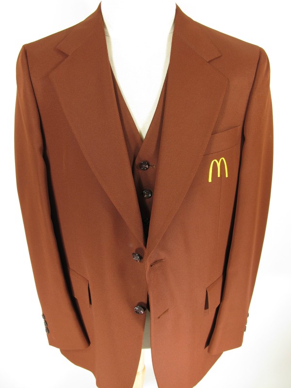
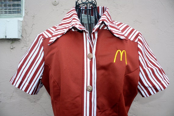
Sure, the Taco Bell look applies, but given the owner of McDonald's was also the owner of the Padres and he modeled both organization's uniforms to be similar, I think it's missing the point to use Taco Bell as the reference.
Spacemans Bong said:They really should be the Padres' uniforms. They're the most identity-less team in baseball.
The Padres (and seemingly half of MLB) change uniforms so much that this new mock up could be what they used for a few years in the 80s or 90s, for all I know.
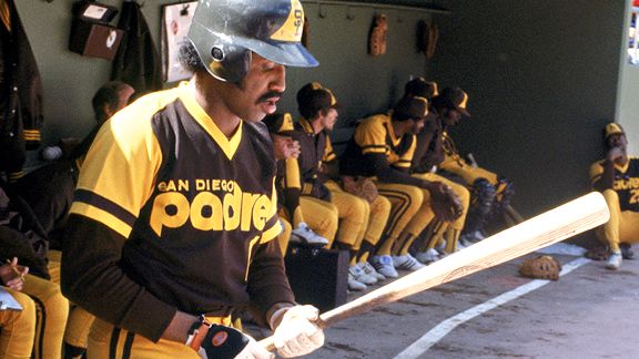
Here's the 1989 home uni:

But of course the font on those 89 uniforms screams "eighties." Using the classic baseball script on the mockups in the first post makes those unis timeless and is a superior look.
And using the old swingin' Padre logo on the sleeve is genius.
And using the old swingin' Padre logo on the sleeve is genius.
adam42381 said:I love the home jerseys. The away ones don't do anything for me.
FWIW, the guy who did these designs intended the brown shirts to be alternates, with what appears to be a gray (or perhaps sand) road uniform:
And the home script as well as the road hats most closely resemble the mid-70's outfits. It's a great look:

And IIRC, they went to navy as the primary color in the early 90's to get back to the look of the PCL Padres of the 50's and 60's. At the time, I thought that the brown uni's had gotten progressively uglier throughout the 80's, and thought the switch was welcome. But yeah, at this point, bring back the brown and yellow...this design would work fine.