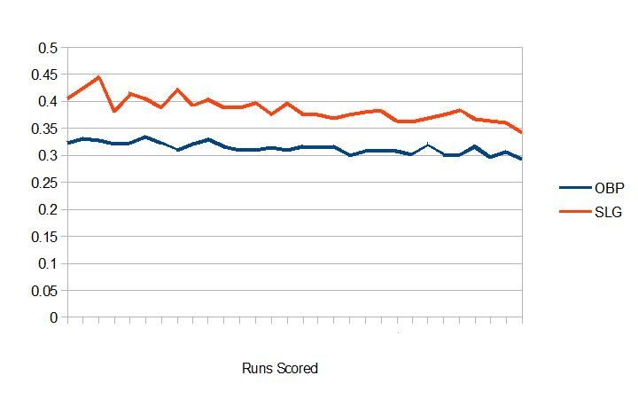
There is a lot of interesting discussion about run scoring and roster construction in the new run scoring environment going on all over the site right now. Check out the excellent bullpen usage thread on the main board for an example. With the Royals and the Giants in the World Series and the general sentiment around baseball that the run scoring environment being down is not a blip on the radar, there are more questions than answers when it comes to building an offense going into this winter, especially for the Red Sox. Ben Cherington was recently quoted as saying...
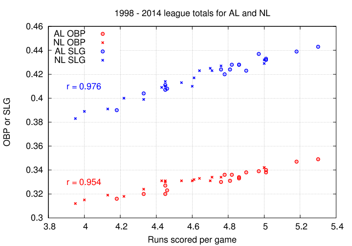
The front office is clearly trying to bring back some of the diversity and flexibility the offense displayed in 2013 with a signing like Castillo (speed), or by trading for Cespedes (power) but Ben seems committed to getting on base a lot as the foundation for the offense. So how did high OBP lineups correlate with run scoring this year versus SLG? Edit: This is a graph showing runs scored (X axis) and how OBP and SLG correlate with them (Y axis). The red line is SLG and the blue line is OBP. I'm sorry the Y axis is not labeled with three decimal places, but I can't figure out how to make Open Office Calc do that. I'll keep digging around tomorrow to see if there's a way to fix that and replace the images again if I can find it.
It's pretty obvious that OBP correlates with run scoring better than SLG, even as run scoring in general is going down. How does this compare to previous years? Looking at it since the most recent expansion through last year (1998-2013) we see... Edit: This is a graph showing all runs scored between the start of 1998 and the end of 2013 (X axis). The red line is SLG and the blue line is OBP.
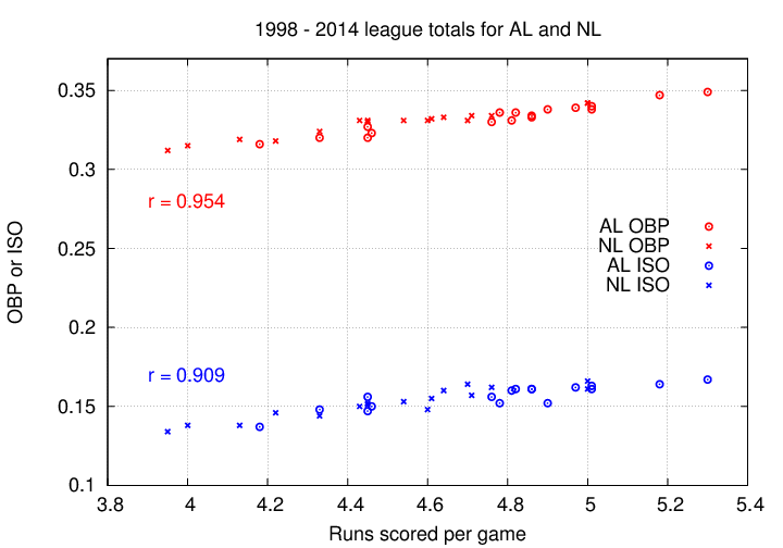
And if we cut it off at the start of the new PED testing in 2006... Edit: This graph shows all runs scored between 1998 and 2005 with runs as the X axis and OBP and SLG on the Y axis again.
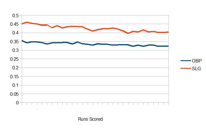
It looks like there is more (as one of my professors used to say about evolution) "variation on the theme" in the 2014 chart than either of the previous two, but that might also be a matter of there being more noise in the smaller sample. The 1998-2005 chart looks to have more variation along the downward trend than 1998-2013, but less than the one from 2014 alone. What remains consistent is that the OBP lines are smoother in all three of them.
Run scoring is down, but I think Cherington is probably correct in not wanting to waiver from the high OBP, grinding lineups that have worked for the club in the past. It remains to be seen whether the additions of Cespedes, Castillo and Craig plus a full season of Mookie and some improvement from Bogaerts will be enough to catapult them back to the top of the league in runs scored, but he has certainly set the team up to have more speed and power than they had in 2014. I'm not sure if this tells us anything new about how to look at offenses across the league or whether having the number 8, 12, 14 and 23 run scoring teams in the majors as the last four standing means anything for long term planning by front offices, but it doesn't seem like 2014 was all that different from previous years in how OBP correlates to run scoring versus SLG.
“Offense has changed. Power, in terms of at least home runs, is down, and even on-base is down across the league. There are all sorts of reasons. We know we need to build a better offense to produce more. I think we have to be careful not to throw out the baby with the bath water. If we can see pitches, grind at-bats, get on base and still hit with power and hit with runners in scoring position, then I still think that’s a formula to score runs, and more runs than our opposition.’’
The front office is clearly trying to bring back some of the diversity and flexibility the offense displayed in 2013 with a signing like Castillo (speed), or by trading for Cespedes (power) but Ben seems committed to getting on base a lot as the foundation for the offense. So how did high OBP lineups correlate with run scoring this year versus SLG? Edit: This is a graph showing runs scored (X axis) and how OBP and SLG correlate with them (Y axis). The red line is SLG and the blue line is OBP. I'm sorry the Y axis is not labeled with three decimal places, but I can't figure out how to make Open Office Calc do that. I'll keep digging around tomorrow to see if there's a way to fix that and replace the images again if I can find it.
It's pretty obvious that OBP correlates with run scoring better than SLG, even as run scoring in general is going down. How does this compare to previous years? Looking at it since the most recent expansion through last year (1998-2013) we see... Edit: This is a graph showing all runs scored between the start of 1998 and the end of 2013 (X axis). The red line is SLG and the blue line is OBP.
And if we cut it off at the start of the new PED testing in 2006... Edit: This graph shows all runs scored between 1998 and 2005 with runs as the X axis and OBP and SLG on the Y axis again.
It looks like there is more (as one of my professors used to say about evolution) "variation on the theme" in the 2014 chart than either of the previous two, but that might also be a matter of there being more noise in the smaller sample. The 1998-2005 chart looks to have more variation along the downward trend than 1998-2013, but less than the one from 2014 alone. What remains consistent is that the OBP lines are smoother in all three of them.
Run scoring is down, but I think Cherington is probably correct in not wanting to waiver from the high OBP, grinding lineups that have worked for the club in the past. It remains to be seen whether the additions of Cespedes, Castillo and Craig plus a full season of Mookie and some improvement from Bogaerts will be enough to catapult them back to the top of the league in runs scored, but he has certainly set the team up to have more speed and power than they had in 2014. I'm not sure if this tells us anything new about how to look at offenses across the league or whether having the number 8, 12, 14 and 23 run scoring teams in the majors as the last four standing means anything for long term planning by front offices, but it doesn't seem like 2014 was all that different from previous years in how OBP correlates to run scoring versus SLG.
")