Rob Vollman just published his mid-year team-by-team player usage charts. Here is the Bruins' chart:
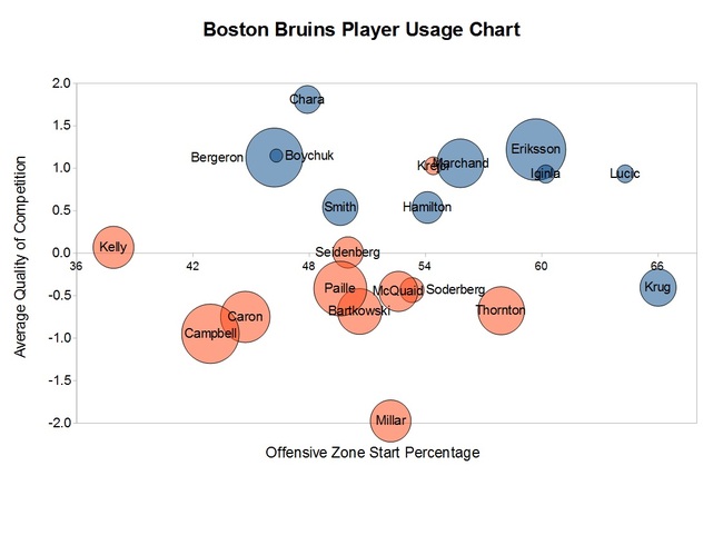
These charts are based on 5-on-5 play only.
The X-axis is "offensive zone start percentage". After a stoppage, how often do particular players start in the offensive vs. defensive zone. On the Bruins, Krug and Lucic are most likely to start their shifts in the offensive zone; Kelly, Campbell, Caron, Bergeron, Chara, and Boychuk were most likely to start in the defensive zone.
The Y-axis is based on each player's average quality of competition. So players near the bottom of the graph (e.g. Millar) play, on average, versus the easiest competition while those at the top of the graph (Chara) play against the best opposing players. Obviously this doesn't mean players are always used this way - it's just a comparison to other players on the team.
If you cut the graph into quadrants, players in the bottom right quadrant (Krug, Thornton, Millar, McQuaid, Soderberg) can be thought of as "sheltered". They are less likely to be on for defensive zone faceoffs and less likely to be on against opponents' better players. In contrast, players in the top left quadrant are those who are used in more of a "shutdown" role - more likely to be on for defensive zone draws against the best opposing players. Unsurprisingly, this is where Bergeron and Chara show up.
The bubble around each player is based on average shot differential while that player is on the ice, which is a way to estimate puck possession. A blue bubble means the Bruins outshoot their opponents while that player is on the ice; the orange bubble means that that the Bruins were outshot during that player's shifts. The size of the bubble is an indication of how big the difference is. The huge blue bubbles for Bergeron and Eriksson suggest that the Bruins consistently get the better of the play when those guys are on the ice. The big orange bubbles (e.g. for Campbell, Caron, and Paille) indicate that they tend to get outshot when they are on the ice.
The take home message from this is that the Bruins' top 6 has generally been excellent - playing against the oppositions most effective players and carrying the play against them - while the bottom 6 has faced easier competition and performed less well. This has generally been the case for the past couple of seasons. In the case of the third line (Kelly), this is partly because they get a lot of ice time against better players.
Overall, this seems encouraging. If Eriksson is able to return and Spooner (not shown on the graph) can stick, that ought to shore up a weak point.